Lux — an atmospheric 2D fantasy-adventure mobile game concept set in a dark, post-catastrophe medieval world. You are the bearer of the last Lux, a mystical lantern that illuminates haunted villages and ruins as you uncover the disaster’s secrets, solve magic-tied puzzles, and make choices that shape whether hope returns or darkness prevails.
Platform: Mobile
Core pillars: Story-driven exploration, mystery discovery, choice-led consequences, and puzzle mechanics using the lantern’s magic
Gameplay highlights: Traverse abandoned villages, gather lore fragments, unlock hidden paths, and solve environment-based puzzles that reveal narrative beats
Visual direction: Haunting, painterly 2D backgrounds and character illustrations to evoke a melancholic, mystical tone
Credits / placeholders: Background art by Diep Bui; character art by Jonatan Cantero; rock illustration (puzzle screen) by Rolando Mallada — assets used as placeholders
Tools used: Photoshop, Illustrator, After Effects, Figma
Status: Conceptual design and visual prototype (not a released playable game)
Main menu.
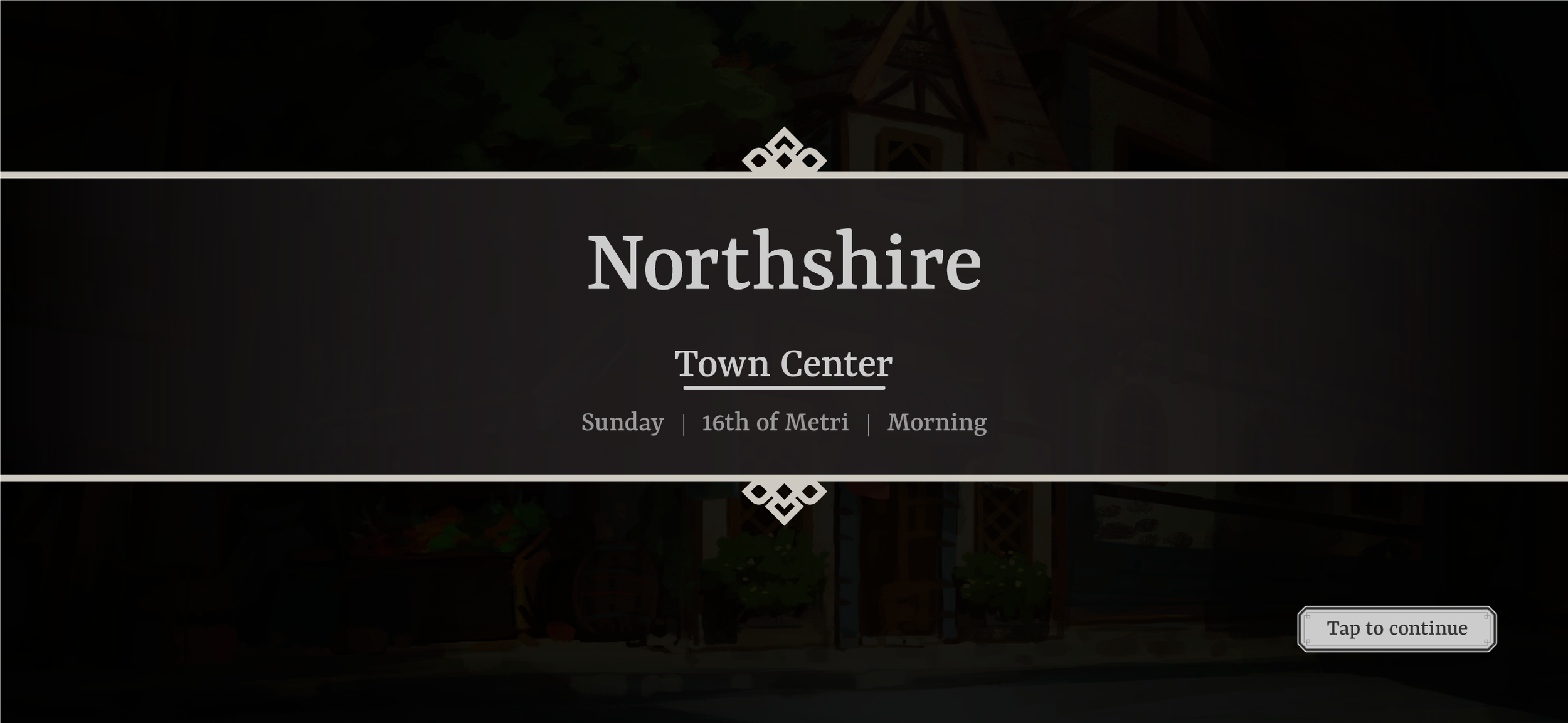
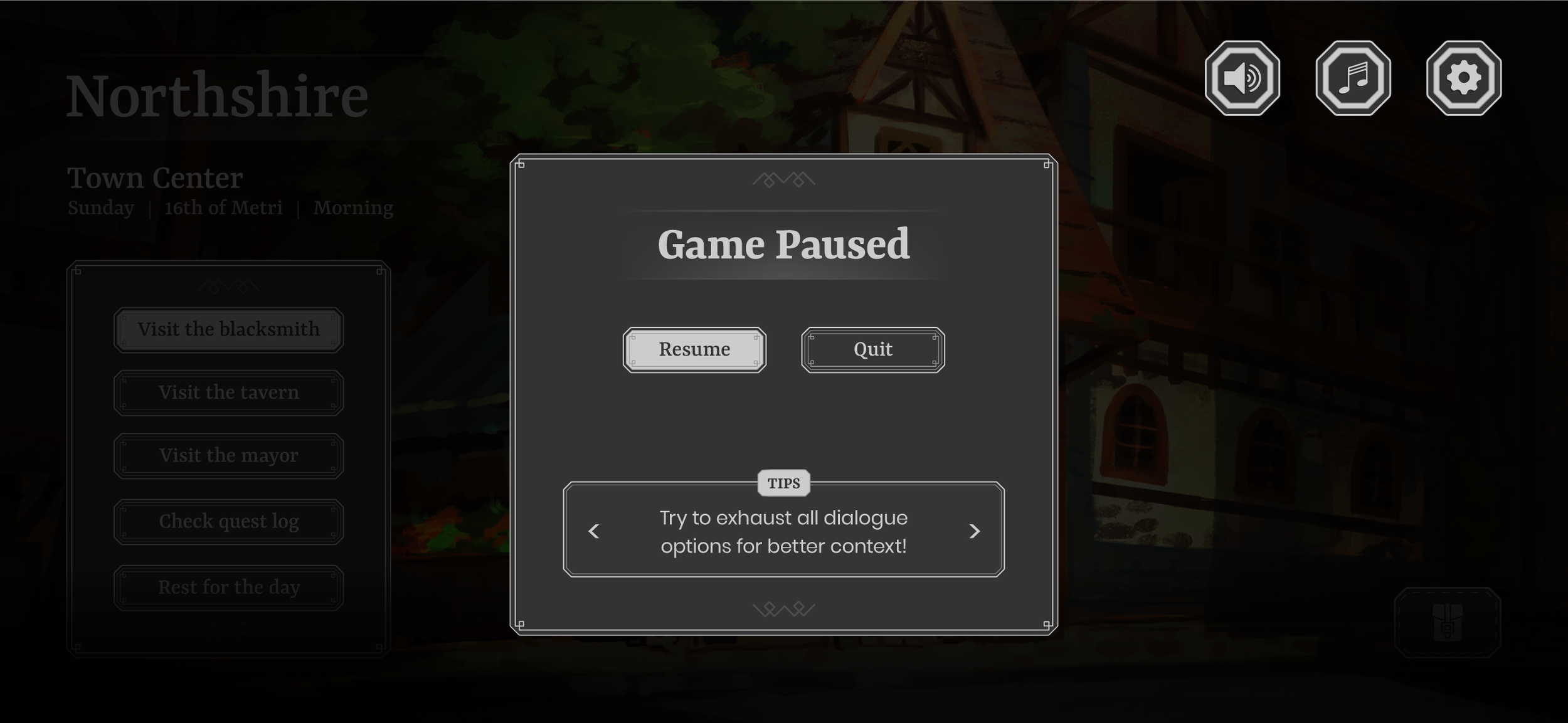
Visiting a village. You can check the different locations, access your quest log or rest.
Map containing explored vs unexplored areas (fog of war). Legend on the right to explain what the icons refer to.
Inventory screen, with an item selected (including its description). Some items may be used for puzzles as shown above.
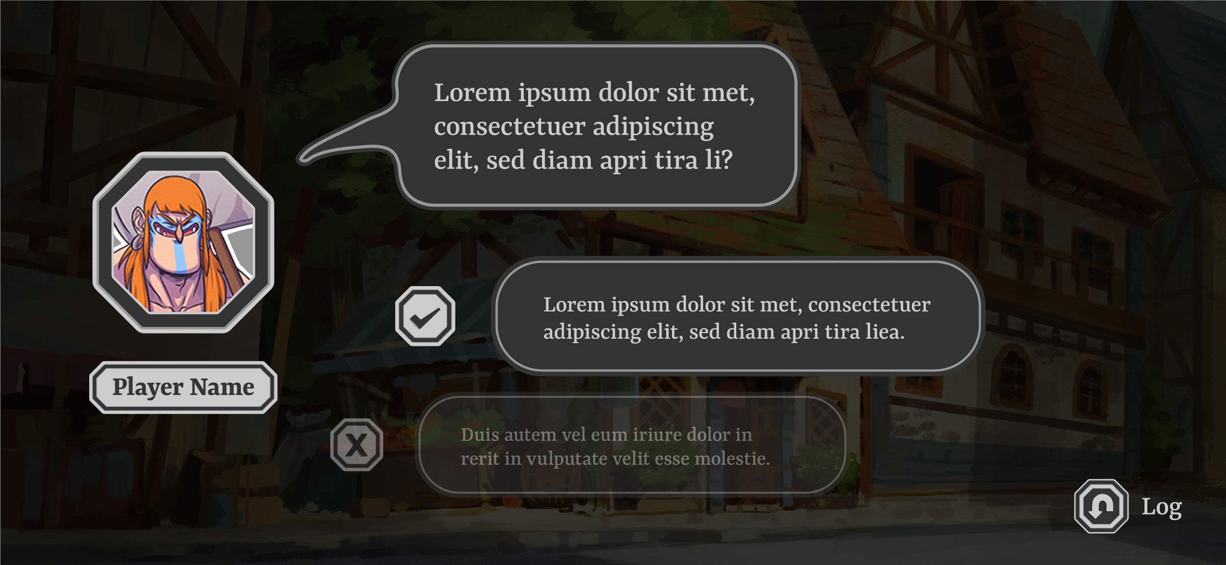
Dialogue choice (between two choices).
Fonts used and game logo.
Color palette.
Wireframe vs high-fid renders, showcasing press and default states.
The above button type is built from the following layer structure (in order). Layer styles are applied to create the desired effect, ranging from overlays, shadows and glows.
Text
Detail (embelishments that make up the inner frame decor)
Outer stroke
Inner stroke
Inner fill
Outer fill
On the right is a visual representation from Photoshop of how this button is built. Since this button is in a pressed state, it had an extra layer of effects that made it stand out from the default state. When working with this many layers, I try and do my best to keep things organised so that when I do need to re-use these layers, I can remember how they were structured and what effects they had.
Other buttons/frames followed very similar styling/structure albeit with some adjustments depending on the context of the asset. For instance, when making the portrait frames for the dialogue screens, it used less layers but with more emphasis on the bevel & emboss effect.
Screenshot taken from Photoshop at how a button (of this type) is structured.
Icon buttons used throughout the game. From left to right, per column:
1) Settings/Main Menu
2) Inventory/Dialogue
3&4) Map
UI frames and elements, across different UI screens.

Wireframes


HIGH-FIDELITY RENDERS

Check out my other projects below!